Jan 24, 2026 | Blog
Document Overview
This comprehensive guide provides a proven 3-step workflow for data preparation with real-world case studies, common pitfalls, and an actionable checklist for researchers and organizations.
Enhancements Included
- 3-step practical workflow (Inspect → Clean → Validate)
- Generic case study (no company/nonprofit naming) set in Calgary, Alberta
- 5 common pitfalls with Alberta/Canada examples
- Tools comparison table by context
- Downloadable Quick Reference Checklist
- Calgary/Alberta/Canada geographic references
- 10 strategic internal service links (placeholders retained)
- Dual CTAs (free consultation + checklist download)
Word Count: ~3,750 words
Reading Time: 15-17 minutes
Target Keywords: data preparation for statistical analysis, data cleaning services Calgary, research data management Canada
How to Prepare Your Data for Statistical Analysis: The Essential Checklist
If you’ve ever felt tempted to “just run the model and clean later,” you’re not alone—and you’re also standing at the edge of the most expensive trap in analytics.
Here’s a scenario we see repeatedly in Calgary and across Alberta:
A team spends weeks building dashboards and running statistical tests—then discovers their dataset contains a silent error (units don’t match, categories aren’t standardized, or missing values were coded inconsistently). Suddenly, the analysis has to be rebuilt from scratch.
That’s not bad luck. That’s what happens when data preparation is treated as optional.
Whether you’re a researcher at a Canadian university finalizing your dissertation, a government agency evaluating program effectiveness, or a business analyzing customer behavior, the quality of your statistical analysis is directly determined by the quality of your data preparation. Skip this phase or execute it poorly, and every subsequent analysis—no matter how sophisticated—becomes unreliable.
This guide provides the exact workflow professionals use to prepare data for analysis, the common mistakes that derail projects, and a downloadable checklist you can apply to your next dataset.
Why Data Preparation Matters More Than the Analysis Itself
Here’s an uncomfortable truth about statistical work: Data preparation typically consumes 60-80% of project time, yet receives a fraction of the attention in training programs and research methods courses.
The consequences of poor preparation are severe:
- Academic research: Retracted papers due to data errors (cases documented in Nature and Science)
- Business decisions: Millions allocated based on flawed analyses
- Government policy: Programs designed around misleading metrics
- Regulatory compliance: Failed audits when data lineage can’t be verified
Consider what happens when you analyze unprepared data:
Scenario: You’re analyzing employee satisfaction survey data (1-5 scale, 1=very dissatisfied, 5=very satisfied)
The hidden problem: During data entry, some responses were coded as 0 (meant to indicate “no response”), others as blank cells, and some legacy data used 99 as “no response”
What you calculate: Mean satisfaction = 3.8 (appears good)
The reality: Those 0s and 99s pulled your average up and down artificially. The true mean after proper cleaning = 3.2 (problematic). Your HR strategy is now based on fiction.
This is where professional data preparation services deliver immediate ROI—catching these issues before they contaminate your entire analysis pipeline.
Key Insight: Data preparation isn’t a tedious preliminary step—it’s the foundation that determines whether your statistical conclusions are publishable, defensible, and actionable.
Understanding the Data Preparation Landscape
Before diving into the workflow, let’s clarify what data preparation actually encompasses:
Data preparation for statistical analysis includes:
- Data inspection: Understanding variable types, distributions, completeness, and potential issues
- Data cleaning: Handling missing values, outliers, duplicates, and inconsistencies
- Data transformation: Creating derived variables, recoding categories, standardizing scales
- Data validation: Verifying assumptions, checking logic, and documenting decisions
This is distinct from (but related to):
- Data collection: Survey design, measurement instruments, sampling strategies
- Data analysis: Running statistical tests, building models, testing hypotheses
- Data visualization: Creating charts and graphs to communicate findings
Many researchers and organizations underestimate this phase because it’s less intellectually glamorous than running sophisticated models. But as experienced statistical consultants across Calgary and Canada will tell you:
Brilliant analysis on messy data yields garbage. Basic analysis on clean data yields insight.
The 3-Step Data Preparation Workflow
Here’s the exact process professionals follow to transform raw data into analysis-ready datasets. This workflow applies whether you’re working with 50 survey responses or 50,000 transaction records.
Step 1: Inspect Your Data (Understand What You’re Working With)
Before touching a single data point, you need a comprehensive understanding of your dataset’s structure, quality, and quirks.
What to inspect:
A. Variable Types & Scales
- Identify each variable as: Continuous (age, revenue), Ordinal (satisfaction ratings), Nominal (gender, region), Date/time
- Confirm that your software correctly interprets each type (common error: phone numbers read as numeric values)
- Check measurement scales: Are all currencies in same denomination? All dates in same format? All measurements in same units?
B. Completeness Assessment
- Calculate missing data percentage for each variable
- Identify patterns: Is data missing randomly, or systematically (e.g., only high-income respondents skipped the income question)?
- Document sample sizes: What’s your starting N? What will be your final N after handling missing data?
C. Distribution Characteristics
- Run basic descriptive statistics: minimum, maximum, mean, median, standard deviation
- Look for impossible values: Negative ages? 200% satisfaction ratings? Birth dates in the future?
- Identify extreme outliers: Values >3 standard deviations from mean warrant investigation
D. Logical Consistency
- Cross-check related variables: Does “years of experience” exceed “age minus 18”?
- Verify date sequences: Is enrollment date before graduation date?
- Confirm categorical consistency: Are all spellings uniform? (“Calgary” vs. “calgary” vs. “Calg”)
Pro tip from years of consulting: Create a data inspection report before cleaning anything. Document what you found—this becomes critical for methodology sections in papers, audit trails for compliance, and debugging when results look strange later.
Step 2: Clean Your Data (Fix Issues Systematically)
This is where you actually correct problems. The key principle: Document every decision. Reviewers, auditors, and future-you need to understand why you made each cleaning choice.
A. Handle Missing Data
You have four main strategies, each appropriate in different contexts:
- Deletion (Listwise or Pairwise)
- When to use: Missing data is <5% and appears random
- Risk: Reduces sample size and statistical power
- Example: Survey with 500 responses, 12 missing age values randomly distributed
- Imputation (Mean, Median, or Mode)
- When to use: Missing data 5-15%, continuous variables
- Risk: Reduces variance artificially, underestimates standard errors
- Example: Replace missing income values with median income of similar demographic group
- Advanced Imputation (Multiple Imputation, Regression)
- When to use: Missing data >15%, data missing systematically
- Risk: Requires statistical expertise; misapplication creates bias
- Example: PhD dissertation with complex survey where missingness relates to other variables
- Missing Data Flag (Create Indicator Variable)
- When to use: Missingness itself might be informative
- Risk: Increases model complexity
- Example: “Declined to answer income” might predict other behaviors
Calgary research example: A University of Calgary health study found that missing blood pressure data correlated with non-compliance—patients who missed measurements also missed medications. Deleting those cases would have biased the effectiveness analysis. Creating a “missing_BP” flag variable revealed this compliance pattern.
When you need expert guidance: If missing data exceeds 15%, or if missingness isn’t random, consult with statistical professionals. Incorrect handling here invalidates every downstream analysis.
B. Address Outliers and Extreme Values
⚠️ Critical rule: Never automatically delete outliers. Investigate first.
Investigation questions:
- Is this a data entry error? (Age = 250 is clearly wrong)
- Is this a unit conversion issue? (One value in kilograms when others are in pounds)
- Is this a legitimate extreme value? (CEO salary in dataset of employee salaries)
- Is this your most important finding? (Breakthrough result that deviates from norms)
Treatment options after investigation:
| Outlier Type | Treatment | When to Use |
|---|
| Data entry error | Correct if source available, delete if not | Impossible values (negative counts) |
| True extreme value | Keep and report | Alberta energy sector breakthrough efficiency |
| Influential observation | Sensitivity analysis (run with and without) | Unclear if legitimate or error |
| Distribution skew | Transformation (log, square root) | Entire distribution right-skewed |
Alberta energy sector example: An “outlier” production efficiency reading 40% above average led to investigation that uncovered a novel extraction technique. Deleting this as an “error” would have cost millions in lost innovation insights.
C. Resolve Duplicates and Inconsistencies
Common duplicate scenarios:
- Survey respondent submitted form twice
- Database merge created duplicate records
- Multiple entries for same customer/subject over time (are these true duplicates or longitudinal observations?)
Resolution strategy:
- Identify duplicates: Define matching criteria (same ID, same name+date, same email)
- Verify intentionality: Are duplicates errors or legitimate repeated measures?
- Choose merge/delete rule: Keep first entry? Keep the most complete entry? Merge information?
- Document removals: Track how many duplicates and your resolution logic
Inconsistency examples and fixes:
</table class=”responsive-table”>D. Transform and Recode VariablesOften your raw data isn’t in the format your analysis requires.
| Issue | Example | Fix |
|---|
| Spelling variations | “United States”, “USA”, “U.S.A.” | Standardize to single format |
| Case sensitivity | “Calgary”, “calgary”, “CALGARY” | Convert all to title case |
| Date formats | “12/03/2025” (Dec 3 or Mar 12?) | Standardize to YYYY-MM-DD |
| Leading/trailing spaces | “Alberta ” vs “Alberta” | Trim whitespace |
| Measurement units | Mix of metric/imperial | Convert all to single system |
- Common transformations:
- Creating derived variables
- Recoding categories
- Standardizing scales
- Handling text/categorical data
Transformation caution: Document your transformation logic meticulously.
Step 3: Validate Your Data (Verify It’s Analysis-Ready)
You’ve inspected, you’ve cleaned—now prove your dataset is ready for statistical analysis.
A. Rerun Descriptive Statistics
Before vs. After comparison:
| Metric | Before Cleaning | After Cleaning |
|---|
| Sample size (N) | 523 | 487 (removed 36 duplicates/invalids) |
| Missing age % | 18% | 3% (imputed where possible) |
| Mean satisfaction | 4.8 (suspiciously high) | 3.9 (realistic) |
| Age range | -5 to 215 (impossible) | 19 to 67 (valid) |
B. Check Statistical Assumptions
Different analyses have different requirements. Verify your data meets them before running tests.
C. Conduct Logic and Sensitivity Checks
Logic checks + sensitivity analyses help ensure results don’t collapse under slightly different cleaning choices.
D. Document Your Data Preparation Trail
Create a data preparation log documenting each decision.
Case Study (Generic): How Poor Data Prep Creates Confidently Wrong Results
Let’s use a generic but realistic scenario we’ve seen across Calgary, Alberta, and Canada.
The setup
A team in Calgary runs a survey-based evaluation with 800 responses to measure satisfaction (1–5 scale). They summarize results for leadership and report:
- “92% satisfied/very satisfied”
Leadership is excited and begins planning an expansion.
What data inspection reveals
During inspection, four issues appear:
- Inconsistent non-response coding
- blanks, 0, and 99 all used as “no response”
- Duplicate records
- 87 people submitted twice (mobile + desktop), so the true sample is 713 unique responses
- Scale reversal in one batch
- an early wave used 1=Very satisfied while the later waves used 5=Very satisfied
- Systematic missingness
- the “staff interaction” section has 31% missing because it was on page two
What happens after proper cleaning
| Metric | Original Summary | After Proper Cleaning |
|---|
| Sample size | 800 | 713 (duplicates removed) |
| Satisfaction rate | 92% | 67% |
| Mean satisfaction score | 4.6 / 5.0 | 3.4 / 5.0 |
| Major concerns identified | None | Staff interaction issues flagged by 43% |
The outcome (and why it matters)
The organization doesn’t “cancel” the program—it improves it before scaling.
That’s the real value of data prep: not perfectionism, but preventing leadership from making high-confidence decisions on low-quality inputs.
Common Data Preparation Pitfalls to Avoid
- Treating data preparation as optional
- Deleting outliers without investigation
- Ignoring missing data patterns
- Inconsistent variable transformations
- Poor documentation (no reproducibility)
Tools for Data Preparation: Choosing Your Workflow
| Context | Recommended Tools | Strengths | Limitations |
|---|
| Academic/Research | Stata, R, SPSS, Python (pandas) | Reproducible scripts, journal-ready documentation | Steep learning curve |
| Business/Organizations | Excel, Power Query, Tableau Prep | Familiar interface, fast for small datasets | Manual steps, doesn’t scale |
| Government/Nonprofit | Often dictated by IT policy | Compliance | May not be optimal |
| Large Datasets (>100K rows) | R, Python, SQL | Efficient memory management, fast processing | Programming required |
Download the complete interactive PDF checklist here—includes expanded guidance for each checkpoint and space to track your project progress.
Conclusion: From Raw Data to Reliable Insight
Proper data preparation prevents misleading results and protects decisions, from peer review, stakeholders, auditors, and executives.
But remember: even perfectly clean data can yield wrong answers if the model itself is flawed. To ensure your analysis is mathematically sound, read our guide on Endogeneity Correction: A Practical Guide to Fixing Bias in Regression Models next.
Ready to ensure your data is analysis-ready?
Book a free 30-minute consultation to discuss your project.
Jan 21, 2026 | Blog
In a data-driven world, businesses and researchers are often at a crossroads: drowning in information and expected to extract actionable insight on demand. The catch is that “analysis” isn’t one thing. Descriptive analysis and predictive analysis answer different questions, require different workflows, and fail in different ways. If you use the wrong one, you’ll either produce a beautiful summary that can’t guide decisions or a forecast that’s built on unvalidated assumptions.
Descriptive Analysis: The “What Happened?” Approach
Descriptive analysis operates as a rear-view mirror, presenting a clear snapshot of past events. By analyzing historical data, it answers the foundational question: “What has happened?”
But “what happened” is not a single chart. Done properly, descriptive analysis provides:
- A defensible baseline (typical levels/ranges, seasonality, and what ‘unusual’ looks like)
- A map of variation (by segment/time/channel: who/what/where changes, and by how much)
- A set of definitions everyone can agree on (so you stop arguing about what “conversion” means)
When to use descriptive analysis
Use descriptive analysis when you need a clear understanding of past trends, behaviours, and events. Without accurate descriptive analysis, teams struggle to pinpoint what’s actually changing, limiting their ability to strategize and respond to irregularities.
Practical triggers:
- You’re starting a new project and need a baseline
- You need to describe and pinpoint a KPI change (up/down) before proposing action
- You suspect data quality issues (duplicates, missingness, inconsistent categories)
- You’re preparing for predictive modeling and need feature reliability
Why use descriptive analysis
Descriptive analysis builds a foundational understanding of patterns and events, enabling you to extract insights from large datasets, identify underlying trends, make evidence-based decisions, and set the stage for predictive and prescriptive analysis, ensuring strategies are rooted in real historical evidence.
And here’s the often-overlooked truth: the highest ROI move in analytics is often data cleaning before you describe anything.
Predictive Analysis: The “What Could Happen?” Approach
Predictive analysis uses statistical methods and machine learning techniques to make educated forecasts from historical data. It provides estimates, not certainties, about what might occur in the future—probability-driven forecasting rather than describing existing facts.
Predictive analysis is powerful because it helps you move from hindsight to planning. But it also raises the standard:
- Your definitions must be stable
- Your training data must reflect the future environment (or you need monitoring)
- Your model must generalize beyond last quarter’s quirks
This is where statistical modeling becomes the backbone: choosing methods that fit your data, target, and risk tolerance.
When to use predictive analysis
Predictive analysis is crucial when you need to anticipate potential outcomes, trends, or phenomena based on historical datasets. It provides a forward-looking lens by generating probabilistic predictions (with uncertainty), which can inform planning, targeting, and scenario testing, especially when validated in a way that mirrors real-world use.
Practical triggers:
- You need forecasts (demand, staffing, inventory, budget)
- You need risk scoring (churn, fraud, default, non-compliance)
- You need early warnings (leading indicators)
- You need what-if forecasting / scenario planning (how predictions shift under different assumptions; use causal methods if you need true impact)
Why use predictive analysis
Predictive analysis helps you forecast outcomes or estimate risk from historical data, adding a forward-looking lens to your work. It produces probabilistic predictions (with uncertainty) that support planning, prioritization, and scenario assumptions, so your analysis guides future decisions rather than only summarizing the past.
And to ship predictive work in the real world, you need reproducibility: clean code, trackable features, and consistent outputs. That’s where statistical programming becomes a competitive advantage.
A Practical Workflow: From Clean Data → Descriptive Baseline → Predictive Forecast
This is the 3-step process we use to stop projects from stalling at “we made a dashboard” or “we built a model” and move toward decision-ready outputs.
Step 1: Clean and validate the dataset (before you trust any summary)
You can’t outrun data quality. Start here:
- Confirm variable definitions (what is a “customer”? what is a “conversion”?)
- Identify duplicates, missingness patterns, outliers and category inconsistencies
- Validate time fields (timezone shifts and date parsing are silent assassins)
If Data Cleaning isn’t done properly, descriptive results drift and predictive models happily learn your errors.
Step 2: Build the descriptive baseline (what is normal, what is changing, what is noise)
Deliverables that actually matter:
- A baseline summary (means/medians, distributions)
- Segment comparisons (region, channel, cohort)
- Trend decomposition (seasonality vs structural change)
This is the moment where good data analysis turns “numbers” into “understanding.”
Step 3: Choose and validate a predictive approach (forecast with humility)
- Pick a model aligned with the decision (accuracy vs interpretability)
- Validate out-of-sample (not just on the same data)
- Report uncertainty (ranges, intervals, risk levels)
The model is only half the job. Communicating it clearly is what makes it usable.
For stakeholder-facing outputs, strong statistical reporting keeps predictive insights from turning into false certainty.
Case Study: Alberta Operations Forecast That Failed (Until the descriptive layer was fixed)
Imagine an Alberta-based team forecasting weekly service demand.
The predictive plan
They build a forecast model using last year’s weekly volume and a few predictors (marketing spend, staffing levels, local events). The model performs fine on a random train/test split (but wasn’t backtested on rolling weeks).
What goes wrong
Two weeks later, the forecast misses badly.
❌ What most teams do: Blame the model and start swapping algorithms.
The descriptive reality
A fast descriptive audit reveals:
- A category recode changed mid-year (two service types merged)
- Duplicate records inflated volume in certain weeks
- Missingness spiked when staffing schedules changed (a pipeline/capture issue, not demand)
In other words: the model wasn’t predicting demand. It was predicting data artifacts.
The fix
- Step 1: Clean + reconcile definitions and categories.
- Step 2: Rebuild descriptive baselines and segment trends.
- Step 3: Refit the forecast with corrected features + rolling backtests.
✅ The real insight: Predictive performance problems are often descriptive problems in disguise.
Common Pitfalls (and how to avoid shipping confident nonsense)
- Using descriptive outputs as if they prove causality
Descriptive summaries are not causal claims. - Ignoring data cleaning (and assuming the data is “close enough”)
Dirty inputs distort descriptive baselines and predictive models will faithfully learn those errors. - Skipping data and definition validation before predictive modeling
Models trained on unstable definitions produce unstable forecasts. - Evaluating predictive models on the wrong metric
If the decision is reallocation, calibration and uncertainty can matter as much as raw accuracy. - Reporting a single forecast number without uncertainty
Stakeholders interpret point estimates as guarantees. - Treating code as an implementation detail
Reproducible, versioned workflows prevent “it worked on my machine” analytics.
Tools of the Trade (and the tools vs expertise reality check)
Analytics isn’t a software shopping problem, it’s a method, workflow, and interpretation problem.
Reality check: tools can compute. They can’t choose the right question, validate assumptions, or prevent misinterpretation.
Quick Reference Guide: Descriptive vs Predictive
| If your goal is… | Use… | Output | What can go wrong if you skip steps |
|---|
| Understand what happened | Descriptive | Trends, summaries, anomalies | You summarize errors and call them insights |
| Explain why something changed | Descriptive + diagnostic methods | Segments, tests, driver hypotheses | You confuse correlation for causation |
| Forecast what’s next | Predictive | Probabilistic forecasts | You forecast unstable definitions or drift |
| Plan actions with risk awareness | Predictive + reporting | Ranges, scenarios | Stakeholders treat point estimates as guarantees |
Conclusion: Make Decisions on Insight, Not Hunches
Descriptive and predictive analysis are two sides of the same coin. Understanding what happened provides the foundation (descriptive) on which you can anticipate future trends (predictive). The strongest data strategies don’t pick one, they sequence them.
Whether you’re a business seeking an edge or a researcher pushing knowledge forward, analytics should help you see where you’ve been, and where you’re headed. Or, to borrow the simplest rule: make decisions based on insights rather than hunches.
Apr 1, 2024 | Blog
In regression analysis, a model can look “statistically significant,” produce clean coefficients, and still be wrong in the only way that matters: it can mislead decisions. That’s what makes endogeneity such a problem. It doesn’t always announce itself. It just quietly turns your coefficient into a persuasive lie.
If you’re a researcher, economist, evaluator, or analyst in Alberta (or anywhere Canada-wide) working with observational data, endogeneity is one of the most common reasons results fail peer review, don’t replicate, or don’t hold up when a policy or program gets scaled. And if you’re in industry, it’s the reason your “growth driver” changes every quarter.
At Select Statistical Consulting, we help clients detect endogeneity and implement endogeneity correction strategies so findings stay reliable, defensible, and decision-ready.
What Is Endogeneity? (And Why “Correlation with the Error Term” Is Not Just Jargon)
Regression models assume your explanatory variables are exogenous—meaning they are not correlated with the error term. Endogeneity happens when that assumption breaks: one (or more) explanatory variables correlates with the error term in your regression. When that happens, ordinary least squares (OLS) estimates become biased and inconsistent, which means you can’t trust the size—or even the direction—of your effect.
Here’s the plain-English version:
OLS is trying to estimate the causal effect of X on Y.
- The “error term” absorbs all the stuff you didn’t measure or didn’t include.
- If X is tangled up with that unmeasured stuff, your model attributes some of that hidden influence to X.
- Your coefficient starts answering the wrong question.
So endogeneity is not a small technical footnote. It’s a model identification problem: “Can we credibly interpret this coefficient as causal?”
The Three Big Causes of Endogeneity (The Usual Suspects)
Endogeneity doesn’t happen randomly. It tends to show up in predictable ways—especially in social science, program evaluation, policy, and operational/business settings.
1) Simultaneity (X and Y push each other)
Simultaneity happens when causality runs both directions between the dependent and independent variables. A classic example is supply and demand: price affects demand, but demand also affects price. In practice, this shows up any time your outcome and your predictor evolve together.
Common real-world flavour:
- Hiring more staff reduces wait times, but increasing wait times also triggers hiring decisions.
2) Omitted Variable Bias (the missing factor lives in the error term)
If a relevant variable is missing from the model, its effect gets pushed into the error term. When that missing variable relates to both Y and X, the error term becomes correlated with X—endogeneity achieved.
Common real-world flavour:
- You model salary as a function of education, but omit ability or experience quality. Education now “absorbs” part of those omitted effects.
3) Measurement Error (your X is noisy)
If an independent variable is measured inaccurately, the measured X differs from the true X. That error distorts estimation and can introduce endogeneity.
Common real-world flavour:
- Self-reported income, self-reported productivity, or survey scales treated as “precise” numeric measures.
Why Endogeneity Matters (Aka: Why Your Model Might Be Confidently Wrong)
Ignoring endogeneity leads to biased parameter estimates, inconsistent results, and faulty conclusions. The downstream damage is practical:
- Policymakers may back the wrong intervention
- Organizations may invest in the wrong lever
- Researchers may publish results that don’t replicate
- Teams waste cycles “optimizing” against a coefficient that’s not causal
This is why endogeneity is one of the biggest threats to credible inference in econometrics and applied regression work.
A Practical Workflow for Endogeneity Correction (3 Steps)
Theory is nice. Deadlines are nicer. Here’s the 3-step workflow we use to move from “I ran a regression” to “I can defend this coefficient.”
Step 1 — Detect the Risk: “Is endogeneity plausible here?”
You don’t start by picking IV vs DiD like you’re ordering off a menu. You start by asking: Does my study design create plausible sources of correlation between X and the error term?
Quick red flags (if you see these, slow down)
- Your key independent variable is a choice (e.g., opt-in program participation)
- Your key independent variable is a response to the outcome (policy changes after performance drops)
- Your model relies heavily on self-reported measures
- You’re using observational data but talking like it’s an experiment
- Results flip dramatically when you change controls (unstable coefficient)
This is where good data analysis matters—profiling variables, sanity checking distributions, and spotting patterns that suggest selection or feedback loops. Data Analysis
“Endogeneity suspicion test” you can run in a meeting
Ask:
“If we changed X tomorrow, would something else change at the same time that also affects Y?”
If yes, you have a serious risk of endogeneity.
Step 2 — Diagnose the Cause: simultaneity, omitted variables, or measurement error?
Endogeneity correction is only as good as the diagnosis. Different causes point to different fixes.
A) If it’s simultaneity…
You need a strategy that breaks the feedback loop. Instrumental variables are common here, but only if you can justify a valid instrument.
B) If it’s omitted variable bias…
You’re searching for either:
- a design that differences out time-invariant unobservables (DiD / fixed effects), or
- an instrument that isolates exogenous movement in X, or
- a control-function style approach (in certain selection settings)
C) If it’s measurement error…
Sometimes the “fix” isn’t fancy econometrics. It’s data cleaning and variable construction. Bad measurement contaminates everything downstream. If the variable definition is unstable, no model can rescue interpretation. Data Cleaning
Step 3 — Correct + Validate: pick the method that fits the data-generating process
The original post lists four correction approaches: IV, 2SLS, DiD, and control functions. We’ll keep them—but upgrade the “how” so readers can actually use them responsibly.
Method 1: Instrumental Variables (IV)
Goal: Use an instrument Z that:
- is correlated with the endogenous regressor X (relevance), and
- does not directly affect Y except through X (exclusion restriction)
This is powerful and also easy to misuse. The hard part isn’t running IV—it’s defending the instrument.
When IV is a good fit
- You have a credible source of exogenous variation in X
- The instrument story makes sense in your domain (policy threshold, timing shock, geographic assignment, etc.)
What to validate
- Strong first stage (weak instruments make estimates unstable)
- Sensitivity checks (robustness to alternative specifications)
- Transparent reporting (so readers can judge validity)
This is where statistical modeling expertise makes the difference between “I ran IV” and “my identification strategy is coherent.” Statistical Modeling
Method 2: Two-Stage Least Squares (2SLS)
2SLS is the implementation workhorse of IV.
- Stage 1: Regress X on instrument(s) Z (+ controls), get predicted X-hat
- Stage 2: Regress Y on X-hat (+ controls)
It sounds mechanical. The real work is in:
- selecting instruments,
- ensuring assumptions hold,
- and presenting inference correctly.
If you’re implementing 2SLS in practice—especially with complex data pipelines or multiple models—strong statistical programming matters for reproducibility and auditability (Stata/R/Python workflows, clean do-files/scripts, versionable outputs). Statistical Programming
Method 3: Difference-in-Differences (DiD)
Goal: Compare changes over time between treated and control groups, assuming parallel trends in absence of treatment.
DiD is often a great fit for program evaluation and policy changes across Alberta or Canada-wide, where interventions roll out at different times or to different units. But it’s only credible if you defend the assumptions.
When DiD is a good fit
- You have panel data (or repeated cross-sections)
- There’s a discrete intervention
- You can justify the comparison group
What to validate
- Pre-trends (placebo tests / event study)
- Sensitivity to windows and controls
- No major confounders moving at the same time
Method 4: Control Functions
Control functions are a family of approaches that model the source of endogeneity directly (often used in selection bias contexts). Think of this as: “I can’t ignore the selection mechanism, so I model it.”
This can be useful, but it’s more technical and depends heavily on correct specification.
Case Study: Endogeneity Correction in the Wild (Why “OLS Worked” Isn’t a Defense)
Let’s build a practical example you can picture.
Scenario
A Canada-wide organization wants to know whether training hours (X) improve employee productivity (Y).
They run OLS and get:
- Training hours coefficient: +0.8 (looks strong)
- p-value: < 0.01
Conclusion: “Training causes productivity gains.”
❌ What most people do
Stop here and take the win.
The endogeneity reality check
Two obvious endogeneity mechanisms are lurking:
- Reverse causality / simultaneity
High performers may be the ones chosen for more training (or are more likely to sign up). Productivity influences training hours.
- Omitted variable bias
Motivation, manager quality, or team culture affects both training participation and productivity.
So training hours correlate with the error term (unobserved motivation/manager quality), and OLS inflates the coefficient.
✅ What endogeneity correction changes
A more defensible approach might be:
- Use a credible instrument (e.g., training availability due to scheduling or rollout constraints) if it’s truly unrelated to productivity except through training, or
- Use DiD if training is rolled out to some units over time and you can justify comparison groups and pre-trends
The point isn’t “always use IV” or “always use DiD.” The point is: the correction method must match how the bias is created.
This is exactly why we emphasize end-to-end work: diagnosis (data analysis), identification (statistical modeling), implementation (statistical programming), and communication (statistical reporting).
Common Pitfalls (How Endogeneity Correction Goes Sideways)
Endogeneity correction methods aren’t “magic bias removal.” They’re identification strategies with assumptions. Here are the mistakes that most often sink credibility.
Pitfall 1: Treating “controls” as a cure for endogeneity
Adding more covariates can reduce omitted variable bias, but it doesn’t fix simultaneity, doesn’t fix measurement error, and can introduce collider bias if you control for the wrong thing.
Pitfall 2: Weak or “convenient” instruments
The exclusion restriction is not optional. If your instrument affects Y directly, you’re just laundering bias through a two-stage pipeline.
Pitfall 3: Using DiD without defending parallel trends
If your treated group was already trending differently pre-intervention, DiD doesn’t estimate treatment—it estimates trend differences.
Pitfall 4: Measuring X poorly and then overfitting the model
If the variable is noisy or inconsistently defined, you can’t interpret effects cleanly. This is often where data cleaning and variable harmonization do more for validity than adding a fancier estimator.
Pitfall 5: Reporting results like a black box
Even correct methods fail adoption if stakeholders can’t understand what you did. Strong statistical reporting turns identification logic into decision-ready communication. Statistical Reporting
Tools of the Trade (and the critical caveat)
Tools you can use for endogeneity correction
- Stata / R / Python for IV/2SLS, DiD, fixed effects, diagnostics, robustness checks
- Reproducible scripts, versioning, and clean output exports so results can be audited
If your organization wants implementable, reproducible code (especially in Stata-heavy environments), statistical programming support is often the difference between a one-off analysis and a workflow you can reuse across projects (Alberta programs, Canada-wide datasets, multi-year evaluation pipelines). Statistical Programming
The caveat: tools don’t equal identification
Software can run IV in one line. It cannot tell you whether your instrument is valid. That part is causal reasoning + domain context + transparent reporting.
Quick Reference Guide: Endogeneity Correction Decision Table
| What you’re seeing | Likely cause | What to do | What to validate |
|---|
| X is a choice/selection (opt-in, targeted, eligibility) | Omitted variables / selection | Consider DiD / fixed effects / control function | Pre-trends, sensitivity, clear mechanism |
| X and Y influence each other | Simultaneity | IV/2SLS (if credible instrument exists) | Instrument relevance + exclusion story |
| X is self-reported or inconsistently defined | Measurement error | Data cleaning + variable construction; reconsider model | Stability checks, data audit trail |
| Coefficients unstable across specs | Multiples | Step back: diagnose; don’t just “add controls” | Robustness, alternative models |
To execute these well in practice, the work typically spans:
Conclusion: From “Regression Output” to Defensible Evidence
Endogeneity is one of the biggest threats to valid inference because it produces results that are both statistically neat and practically wrong. The fix is not one estimator—it’s a workflow: detect risk, diagnose the mechanism, correct with an appropriate strategy, and validate transparently.
For teams working across Alberta and Canada-wide, this matters because real-world data is messy, observational, and full of feedback loops. The goal isn’t academic perfection; it’s decision-safe evidence.
Two next steps (pick your path)
- Low-friction: Book a free 30‑minute consultation to diagnose your endogeneity risk and identify the right correction path.
- If you already know you need help implementing: Explore the services most commonly used for endogeneity correction work:
Mar 1, 2024 | Blog
In today’s data-driven age, both businesses and researchers find themselves at a crossroads: inundated with information and tasked with deriving actionable insights. Whether it’s predicting market trends or discerning patterns in complex datasets, understanding the nuances between descriptive and predictive analysis becomes pivotal. Let’s dive into the complexities of these analytical tools and determine when each shines the brightest.
Descriptive Analysis: The “What Happened?” Approach
Descriptive analysis operates as a rear-view mirror, presenting a clear snapshot of past events. By analyzing historical data, it answers the foundational question: “What has happened?”
When to Use
Descriptive analysis is paramount when you need a clear understanding of past trends, behaviours, and events. In the absence of accurate descriptive analysis, you struggle to pinpoint the causes of specific trends and behaviours, limiting their ability to strategize and craft effective responses to any irregularities.
Why to Use
Descriptive analysis provides a foundational understanding of past patterns, behaviours, and events, enabling you to extract meaningful insights from large datasets, identify underlying trends, make evidence-based decisions, and set the stage for predictive and prescriptive analysis, ensuring that strategies and hypotheses are rooted in concrete historical evidence.
Predictive Analysis: The “What Could Happen?” Approach
Predictive analysis employs statistical methods and machine learning techniques to make educated forecasts using historical data. It provides estimates, not certainties, about what might occur in the future, positioning it as an advanced form of data analysis that relies on probability-driven forecasts instead of just analyzing existing facts.
When to Use
Predictive analysis is crucial when you aim to anticipate potential outcomes, trends, or phenomena based on historical datasets, utilizing it as a key methodological tool to test hypotheses, inform future studies, and provide a forward-looking perspective that enhances the depth, relevance, and applicability of your findings in real-world scenarios.
Why to Use
Predictive analysis empowers you to forecast potential trends and outcomes based on historical data, thereby enriching you analyses, enhancing the validity of your hypotheses, and ensuring your findings not only reflect past and present observations but also provide invaluable insights and guidance for future scenarios, decisions, and interventions.
“Descriptive and predictive analysis are two sides of the same coin”
While they cater to different needs, both descriptive and predictive analysis are essential to a holistic data strategy. Understanding what happened in the past provides a foundation (descriptive) upon which you can build and anticipate future trends (predictive).
In Conclusion
Whether you’re a business aiming to gain a competitive edge or a researcher pushing the boundaries of knowledge, data analysis is a formidable ally. By discerning the roles of descriptive and predictive analysis, you can tap into the full potential of your data, ensuring you don’t just understand where you’ve been, but have a clear vision of where you’re headed. Remember, in the vast ocean of data, let past insights chart the course for future discoveries.
“Make your decisions based on insights rather than hunches”
Feb 1, 2024 | Blog
Data tells a story, but raw numbers often speak a language few can understand. Whether you’re a PhD student at the University of Calgary or an energy executive in Alberta, you are likely swimming in data. But having data and understanding it are two different things.
This guide will show you not just what these tools are, but how to apply them effectively, common mistakes to avoid, and when expert guidance can accelerate your research or business objectives.
Understanding Descriptive Statistics: The Foundation of Data Analysis

At the heart of any research lies raw data, a vast expanse of numbers and observations. Descriptive statistics serve as the compass in this expanse, providing essential insights about your data’s central tendencies, dispersions, and overall patterns.
Key measures include:
- Mean (average): The sum of all values divided by the count—your data’s center point
- Median: The middle value when data is ordered—more reliable than mean for skewed data
- Mode: The most frequently occurring value—reveals common responses or outcomes
- Standard deviation (SD): Measures how spread out your data is—low SD means consistency, high SD signals variability
Without this foundational understanding, diving deeper into analysis or drawing meaningful conclusions becomes risky. A dataset with a mean satisfaction score of 4.2/5 tells one story; adding that the standard deviation is 1.8 (indicating massive variability) tells a completely different story.
Key Insight: Descriptive statistics provide a foundational overview of data, enabling researchers to capture and communicate the essential characteristics and patterns within their datasets before moving to advanced analysis.
The Power of Visual Representation in Research
While numbers and calculations are central to understanding data, presenting these findings is a separate challenge. The human brain processes visual information 60,000 times faster than text, and we retain 80% of what we see compared to just 20% of what we read.
Transforming numbers into visuals, graphs, charts, plots, adds a layer of clarity and comprehension that raw statistics simply cannot match. A well-crafted box plot or scatter plot can make patterns, trends, or anomalies leap out, offering insights that might be buried in tables of numbers.
This visual representation becomes especially crucial when:
- Communicating findings to non-technical stakeholders (executives, policymakers, funding committees)
- Submitting research for peer review (journals increasingly require visual data presentation)
- Making time-sensitive decisions (a trend line reveals direction faster than scanning 50 data points)
Key Insight: Data visualization transforms complex datasets into intuitive visuals, enhancing comprehension and facilitating clearer insights across diverse audiences—from academic reviewers to business decision-makers.
A Practical Workflow: From Statistics to Visualization
Theory is valuable, but application is essential. Here’s the exact 3-step process professionals use to move from raw data to actionable insights:
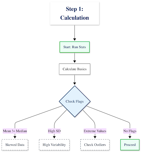
Step 1: Calculate & Interpret Your Descriptive Statistics

Start by running the numbers, then interrogate what they mean:
- Calculate the basics: Mean, median, mode, standard deviation, range
- Look for red flags:
- Is your mean very different from your median? Your data is likely skewed
- Is your standard deviation larger than expected? You have high variability or potential outliers
- Are there extreme minimum/maximum values? Investigate these before proceeding
Example interpretation:
“Our customer response time data shows a mean of 24 hours with a standard deviation of 18 hours. The high SD tells us response times are inconsistent—some customers wait 6 hours, others wait 48+ hours. This isn’t a training problem (average is acceptable); it’s a consistency problem.”
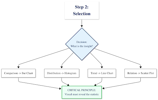
Step 2: Identify the Story & Select the Right Visual

Your statistics should guide your visualization choice. Use this decision framework:
What insight are you communicating?├─ Comparing categories or groups
│ └─→ Use: Bar chart or column chart
│ Example: Average revenue by region
├─ Showing distribution or spread of values
│ └─→ Use: Histogram or Box plot
│ Example: Distribution of employee salaries
├─ Tracking change over time
│ └─→ Use: Line chart
│ Example: Monthly website traffic trends
├─ Exploring relationships between two variables
│ └─→ Use: Scatter plot
│ Example: Correlation between advertising spend and sales
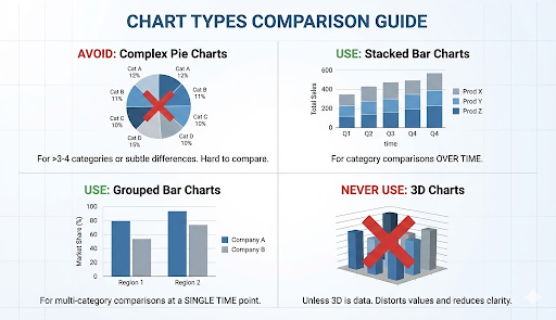
└─ Showing composition (parts of a whole)
└─→ Use: Stacked bar chart (avoid pie charts with >3-4 categories)
Example: Budget allocation across departments
⚠️ Critical principle: Your descriptive statistics should inform your visual choice. If you discovered high standard deviation, your visualization must show that spread—a simple bar chart of means would hide the very insight you uncovered.
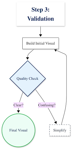
Step 3: Create, Refine & Validate

Build your visualization, then ask these quality-control questions:
- Does this visual show what my statistics revealed? If you found bimodal distribution, does your histogram show two peaks?
- Can a non-expert understand this in 10 seconds? If not, simplify
- Are all elements necessary? Remove gridlines, 3D effects, or decorative elements that don’t communicate data
- Is it accessible? Use colorblind-friendly palettes (avoid red-green combinations alone)
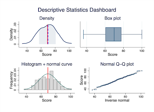
Case in Point: Analyzing Customer Satisfaction Data

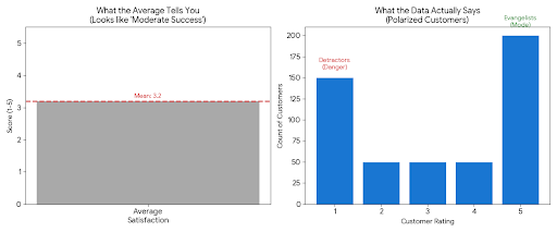
The Raw Statistics Tell You:
- Mean: 3.2 (“slightly above average”)
- Median: 3.0
- Standard Deviation: 1.6 (very high for a 5-point scale)
- Mode: 5 (most common response)
❌ What most people do: Create a simple bar chart showing the average score of 3.2 and conclude “customer satisfaction is moderate but needs improvement.”
What the statistics actually reveal: Look at the distribution:
- 180 customers rated 5/5 (love it)
- 200 customers rated 1/5 (hate it)
- 120 customers scattered between 2-4
✅ The real insight: Your customers aren’t “moderately satisfied”—they’re polarized. You have evangelists and detractors, with few in the middle. That’s a completely different strategic problem than “generally mediocre service.”
Visualization Comparison
| ❌ What Hides the Insight | ✅ What Reveals the Insight |
|---|
| A bar chart showing just the mean (3.2/5) with a note “room for improvement” | A histogram or box plot showing the bimodal distribution—two distinct peaks at 1 and 5, with the mean falling in a valley where few customers actually exist |
This is where experienced statistical consulting adds immediate value: Recognizing when your data is telling a more complex story than simple averages suggest, and knowing exactly how to visualize that complexity for decision-makers.At Select Statistical Consulting, we’ve analyzed thousands of datasets for Canadian businesses, researchers, and government agencies—we know how to extract and communicate insights that others miss.
Beyond the Basics: Common Pitfalls and Best Practices
After years of consulting with clients across Calgary and Canada, we’ve seen these mistakes repeatedly. Avoid them to ensure your analysis stands up to scrutiny:
Statistical Missteps to Avoid
1. Using the mean for skewed data
When data is heavily skewed (e.g., income data where a few high earners pull the average up), the median is far more representative. Academic reviewers and savvy business leaders will notice if you’ve misrepresented the central tendency.
Example: The “average” home price in Calgary might be $550K, but the median is $485K—half of homes cost less than that. The mean is inflated by luxury properties.
2. Ignoring outliers without investigation
That data point that’s 5 standard deviations from the mean isn’t necessarily an error—it could be your most important finding. Investigate before removing.
Alberta energy sector example: An “outlier” production efficiency reading might indicate a breakthrough process improvement, not a measurement error.
3. Not reporting standard deviation alongside means
A mean without its SD is like reporting a weather forecast without mentioning if it might rain. You’re hiding critical information about data variability.
4. Confusing correlation with causation in descriptive stats
Descriptive statistics can show that ice cream sales and drowning rates both increase in summer, but they don’t tell you why. Don’t let summary statistics imply causality without proper analytical methods—that’s where our Statistical Modeling services come in.
Visualization Principles for Clarity

Chart Choice Matters:
- Avoid pie charts when comparing more than 3-4 categories, or when differences are subtle. Academic journals and business reviewers will question poor chart choices.
- Use stacked bar charts for category comparisons over time
- Use grouped bar charts for multi-category comparisons at a single time point
- Never use 3D charts unless the third dimension represents actual data (spoiler: it almost never does)
Design Integrity is Non-Negotiable:
- Don’t truncate the Y-axis to exaggerate differences (starting a bar chart at 95 instead of 0 makes a 5% difference look like 300%)
- Avoid “chartjunk”—unnecessary 3D effects, decorative backgrounds, excessive gridlines, or clip art that distract from your data
- Every element should communicate information, not just decorate
Labeling & Context Build Trust:
- Use clear, descriptive titles: Not “Figure 1,” but “Customer Satisfaction Scores Show Bimodal Distribution (n=500)”
- Label axes with units: “Response Time (hours)” not just “Time”
- Directly annotate key findings on the visual
- Include sample size and data collection period
Accessibility is a Requirement:
- Use colorblind-friendly palettes (tools like ColorBrewer help)
- Label data points directly instead of relying solely on legends
- Provide alt text for digital publications
- Ensure sufficient contrast between colors
Tools of the Trade: From Concept to Creation
The democratization of data tools means you have many options for statistical analysis and visualization. Here’s how to navigate them:
For Statistical Analysis:
| Context | Recommended Tools | Notes |
|---|
| Academic & Research | SPSS, Stata, R, Python |
SPSS dominant in social sciences; Stata in economics; R/Python in computational fields.
We specialize in Stata programming |
| Business & Organizations | Excel, Power BI, Tableau |
Excel for basic stats (<10K rows); Power BI/Tableau for interactive dashboards |
| Government & Nonprofit | Varies (compliance-dependent) |
Often constrained to approved software. We work within your IT environment |
For Visualization:
- Tableau Public: Free, powerful, interactive dashboards
- Power BI: Microsoft ecosystem integration
- Stata: High-quality statistical graphics commonly used in economics and social sciences
- Python (matplotlib, seaborn): Flexible custom visualizations
⚠️ The Critical Caveat: Tools vs. Expertise
Here’s what these tools can’t do:
- Decide whether to use mean or median for your specific data distribution
- Identify when your data violates assumptions underlying your analysis
- Select the visualization that reveals insights rather than obscures them
- Interpret statistical output in the context of your research question or business problem
- Meet the specific requirements of academic journal reviewers or grant evaluators
The reality: A researcher spending 40 hours learning software syntax, debugging code, and troubleshooting visualization formatting could instead focus on their core research questions while statistical consultants handle the technical execution with proven expertise.Our Statistical Training Workshops can get your team up to speed on the essentials, or we can handle the analysis end-to-end—from data cleaning through final publication-ready visualizations.
Quick Reference Guide: Statistics to Visualization
Bookmark this decision guide for your next analysis project:
| Your Goal | Best Statistics | Best Visualization | Common Use Cases |
|---|
| Compare groups | Mean, SD | Bar chart (with error bars) | Sales by region, test scores by treatment group |
| Show data spread | Min/Max, IQR, SD | Box plot or violin plot | Salary ranges, response time variability |
| Track trends over time | Mean or median by period | Line chart | Monthly revenue, patient outcomes over 12 months |
| Explore relationships | Correlation coefficient | Scatter plot | Relationship between ad spend and conversions |
| Show distribution shape | Frequency counts, bins | Histogram | Age distribution of survey respondents |
| Identify outliers | Z-scores, IQR method | Scatter plot or box plot | Fraudulent transactions, measurement errors |
| Display composition | Percentages, proportions | Stacked bar or treemap | Budget allocation, market share |
Need help determining which approach fits your specific dataset? Book a free 30-minute consultation with our team.
Conclusion: From Insight to Impact
As we saw with the customer satisfaction example earlier, raw numbers can obscure critical insights. Descriptive statistics reveal patterns; visualization makes those patterns undeniable. Together, they transform data from a burden into a strategic asset—whether you’re publishing research, evaluating programs, or driving business growth.
The Reality of Rigorous Analysis
Here’s what executing this properly actually requires:
- Choosing the right descriptive measures for your data distribution (and knowing when standard approaches fail)
- Identifying skewness, outliers, and violations of assumptions
- Selecting publication-quality visualizations that meet academic or professional standards
- Iterating through multiple visualization drafts to find the most effective presentation
- Ensuring your findings meet peer review requirements or stakeholder expectations
- Documenting your methodology for reproducibility and audit trails
For most researchers and organizations, this specialized work competes with core priorities—conducting experiments, serving clients, advancing policy initiatives. That’s where expert partnership delivers compounded value: not just better outputs, but accelerated timelines and freed capacity.
Let Our Experts Tell Your Data’s Story
Whether you’re preparing a peer-reviewed publication, a government program evaluation, or a business intelligence report for your Calgary or Canadian organization, Select Statistical Consulting delivers rigorous descriptive analysis and publication-ready visualizations that communicate with clarity, confidence, and impact.
Our services include:
- Data Analysis: Professional transformation of complex datasets into actionable insights
- Data Visualization: Custom charts, dashboards, and graphics designed for your audience
- Data Cleansing: Preparing your data for accurate statistical analysis
- Statistical Reporting: Clear, evidence-based reports for decision-makers or publication
Ready to elevate your data analysis?
📞 Book a free 30-minute consultation to discuss your project—no obligation, just expert guidance on the best path forward.
📊 Explore our full service offerings to see how we support academic researchers, government agencies, and businesses across Canada.